
In some cases, you may want to change the labels associated with a graph's x- and y- axes. For example, many of our clients like to change axis labeling when graphed channels have a convoluted name, and wish to clarify the labels for reporting and presentation purposes without making any permanent alterations across the database.
- Begin by plotting a time series or scatter plot graph.
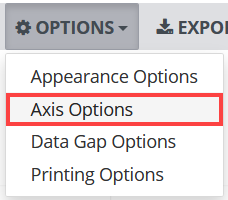
- With your graph open, click Options. A drop-down menu appears.
- Select Axis Options.
2. Modify Axis Labeling
There are four axis options, (Individually Stacked, Single Axis, Overlapped, Custom) and each of these options has it's own set of axis labeling settings. In the image below, we modify the labeling for an 'individually stacked' graph, however you can follow these directions for the labeling of any other option-type.
To learn more about axis layout options, see Modify a Graph’s Axis Layout.
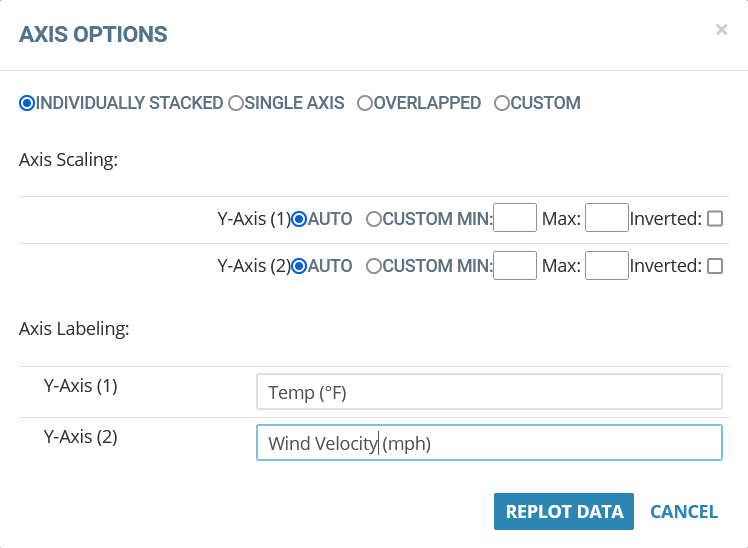
Warning: The axis labeling logic in Axis Settings is set each time you replot the data, but is not dynamically linked to the Custom Axis Assignment. Therefore, if you customize the axis assignment it is necessary to update the axis labels accordingly.
3. Click Replot Data

0 Comments